By Shakiyla Huggins January 23, 2025
As an instructional designer, you’ve likely heard how important it is to have a well-crafted portfolio. It’s your digital business card, showcasing your skills, creativity, and experience to potential employers or clients. However, what many instructional designers overlook is the power of analytics—tracking and understanding how users interact with your portfolio site.
Google Analytics isn’t just for marketers or e-commerce professionals; it’s a valuable tool for anyone with an online presence. By leveraging analytics, you can gain insights into your portfolio’s performance, refine your content, and ultimately create a stronger impression on visitors. Let’s dive into why this matters and how you can use Google Analytics to elevate your portfolio.
The Importance of Portfolio Analytics
Your portfolio site is more than just a collection of work samples; it’s an opportunity to tell your professional story. Analytics allow you to:
- Understand Your Audience: Who’s visiting your site? Are they hiring managers, educators, or peers? Knowing your audience can help you tailor content to meet their needs.
- Identify Popular Content: Which projects or sections get the most views? This tells you what resonates most with visitors and helps you prioritize updates.
- Optimize User Experience: Are visitors leaving certain pages quickly? High bounce rates might indicate that those pages need improvement.
- Measure Your Efforts: If you’ve been sharing your portfolio on LinkedIn or other platforms, analytics can show how those efforts drive traffic.
Let’s Look at some Data from my Portfolio.
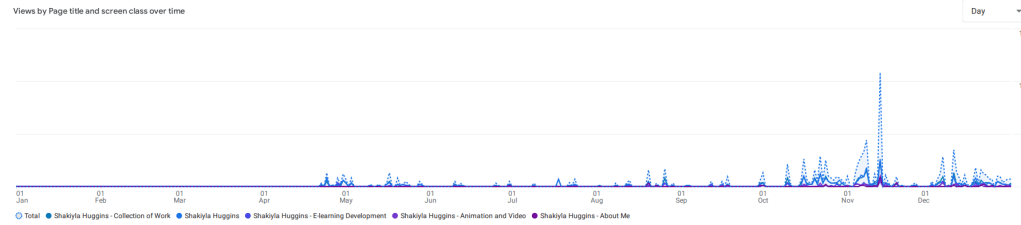
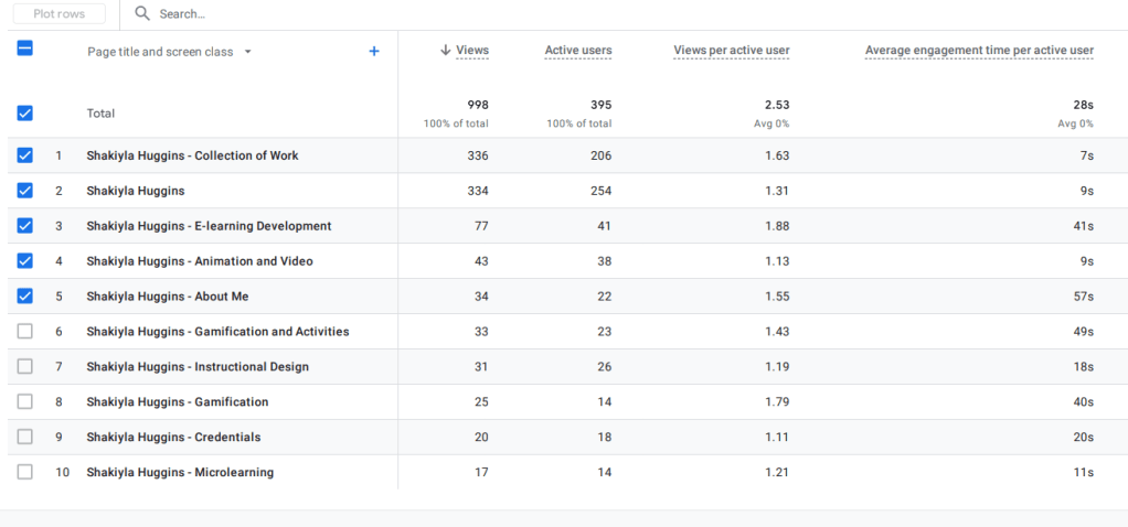
Take a look at the data of each page within my portfolio site for the year 2024. For a better view visit this link.

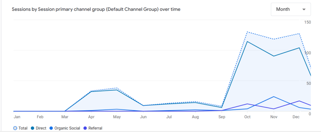
We can take it a step further and view how my visitors are navigating to my site, be it a direct click or search on my link, social media, or even a referral.

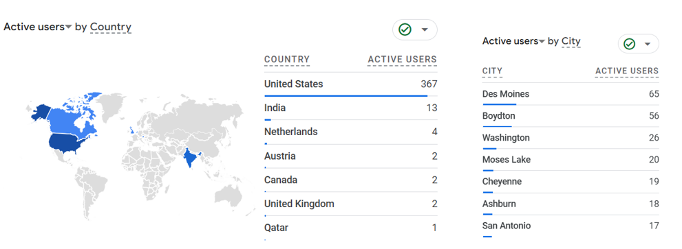
And finally, lets look at data on where my users are located, that are visiting my site.
Lessons from My Portfolio’s 2024 Analytics
Reflecting on my own portfolio analytics from last year, I discovered some compelling insights:
- Top Pages: The initial home page, Shakiyla Huggins, and my “Collection of Work” page both consistently serves as the entry point for all visitors. This is the starting page where users can navigate to specific sections, effectively showing me how many user ventured into my portfolio site. Among these, the “E-learning Development” and “Animation and Video” pages were especially popular, reflecting strong interest in these particular skills and projects.
- Engagement Levels: Pages like “Gamification and Activities” and “Animation and Video” had higher engagement times, suggesting that interactive or visually engaging content keeps visitors’ attention longer. Conversely, the “About Me” page had a shorter engagement time, hinting that it might need a more compelling narrative or design.
- Traffic Trends: I noticed spikes in traffic during certain months, which aligned with when I updated my portfolio or shared it during job applications. This reinforced the importance of actively promoting my work.
- Underperforming Pages: Pages like “Microlearning” and “Credentials” had fewer views and shorter engagement times. These may need more engaging content, better visuals, or clearer value propositions to attract interest.
- Time Spent: No one spent more than 60 seconds on any given page. This means that you only have one minute to deliver value quickly and effectively. Incorporating visuals, concise messaging, and clear calls-to-action can help maximize engagement within this short time frame.
The Changes I’m Making (And Why You Should Consider Them Too)
1. Merging Related Sections for Streamlined Navigation
In my current portfolio, “Gamification and Activities” exists as a standalone section. While important, the analytics show that visitors tend to gravitate toward “E-learning Development” first. To simplify navigation and highlight my work more effectively, I’m combining the two into a single, enriched “E-learning Development” section. This ensures visitors can see all relevant projects without having to switch between sections.
Tip for You: If you have overlapping categories in your portfolio, consider merging them into broader sections that make navigation intuitive.
2. Removing the Homepage
My homepage currently features an image of me and a button leading to the “Collection of Work.” While visually appealing, it acts as an unnecessary step in the user journey. By removing the homepage, I’ll have visitors land directly on the “Collection of Work” page, where they can immediately choose which project to view.
Tip for You: Think about whether your homepage serves a functional purpose. If it doesn’t add value, streamline the experience by guiding users straight to your work.
3. Implementing a Grid Layout for Easy Access
Within each category in the “Collection of Work,” resources are currently displayed in a vertical list. Analytics show that only the top items get significant attention, likely because users don’t scroll far enough to see the rest. To address this, I’ll adopt a grid layout that displays all resources at a glance. Users will be able to view and select projects without the need to scroll.
Tip for You: Use grids to make content more accessible. Ensure your design is responsive, so it looks great on both desktop and mobile devices.
Getting Started with Google Analytics
Here’s how you can set up and use Google Analytics for your portfolio:
- Set Up Tracking: If you haven’t already, integrate Google Analytics with your site. Platforms like WordPress, Wix, and Squarespace offer easy integration options. However, you are not limited to these options as any site can be integrated!
- Define Goals: Establish goals such as time spent on a page, downloads, or contact form submissions. This helps you track meaningful interactions.
- Analyze Behavior Flow: Use the Behavior Flow report to see how users navigate your site. Identify drop-off points to refine navigation and content.
- Track Traffic Sources: Find out where your visitors are coming from—social media, email campaigns, or search engines—to focus your promotional efforts.
- Monitor Key Metrics: Keep an eye on metrics like page views, average time on page, and bounce rate to evaluate performance.
Final Thoughts
Tracking analytics isn’t just a nice-to-have; it’s an essential part of managing your professional portfolio. By understanding how visitors interact with your site, you can make data-driven decisions to improve content, optimize user experience, and achieve your career goals.
So, instructional designers, don’t just create—analyze. Use tools like Google Analytics to ensure your portfolio not only showcases your work but also works for you.
Ready to level up your portfolio? Let me know in the comments how you’re using data to optimize your site, or if you’re considering making similar changes!

Leave a comment